Japanse houtblokprenten hebben een enorme invloed gehad op Nederlandse plateelschilders, die de vogels en bloemen van de prenten overnamen op de decors van vazen, tegels en wandborden.

Inspiration for Dutch Pottery Painters: Japanese Woodblock Prints

Japanese art had a tremendous influence on Art Nouveau and Dutch pottery painters. The woodblock prints of Katsushika Hokusai and Kono Bairei, in particular, can be found on various objects from Dutch pottery factories.

When Japan opened its borders in 1854 after a long period of isolation, Japanese woodblock prints (Ukiyo-e) found their way to Europe. Japanese art became a craze, and the woodblock prints, in particular, became popular collector’s items. European artists copied stylistic elements from Japan in their work. The interest in and influence of Japanese art is also known as Japonism and was one of the driving forces behind Art Nouveau at the end of the nineteenth century.

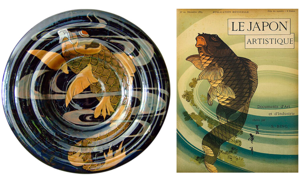
Japanese art from Siegfried Bing’s gallery

Japan actively promoted its art at the 1867 World’s Fair in Paris. Japanese art, as well as everyday objects such as kimonos, fans, and chamber screens, became very popular with the European public. The art trade in Japanese products flourished, especially in Paris. A key player was the German art dealer Siegfried Bing (1838–1905), who had a gallery in Paris specializing in Japanese and Chinese art and everyday objects.
Famous artists, such as Vincent van Gogh and Henry Toulouse-Lautrec, visited Siegfried Bing’s gallery. It is known that both artists owned a collection of woodblock prints, and between 1886 and 1890, they created several works of art influenced by Japonism.

A Dutch wall charger by Rozenburg The Hague, painted with a koi carp, inspired by a cover of the magazine Le Japan Artistique, published by Sigfried Bing in between 1888 and 1891.
Wall charger from Rozenburg, The Hague, 38.5 cm in diameter, featuring a carp. The object was made in 1899 and painted by Willem Hartgring. The fish’s composition is echoed in the woodblock print by Katsushika Taito II (active period 1810-1853), a student of Hokusai. The Rozenburg charger is from the Proportio Divina collection.


The magazine ‘Le Japon Artistique’ or ‘Artistic Japan’

Bing quickly became the driving force behind the Japanese art craze in France. Collectors and artists were all too familiar with Bing’s gallery. Between May 1888 and April 1891, Bing published the magazine ‘Le Japon Artistique’ or ‘Artistic Japan’ In three years, 36 issues appearing in French, German, and English. In 1891 all issues were collected in books, by each volume. By publishing the magazines and trading in prints, Bing ensured the widespread dissemination of Japanese art in Europe.

A vase from the Dutch pottery factory Zuid-Holland from Gouda, model 90, 23.4 cm high, painted with a p/c design by Frederique Delchambre between 1901 and 1907. The hanging fruit is inspired by this print from the magazine ‘Japan Artistique.’ Vase belongs to the Ridgetop Collection.
This toad or frog adorns the back of the bound editions of the magazine ‘Le Japon Artistique’, which were released in 1891. It is also the exact same image on this vase, made by the Dutch pottery factory Rozenburg from The Hague in 1897. It is model 270, a sturdy vase with a wide, flared foot and neck around a rounded belly. The vase is 29.5 cm high and 19 cm wide and painted by W.F. Haas. Source: Art Nouveau Plateel.

Hokusai’s Wave

Japanese woodblock prints have a long tradition, dating from the Edo period of the shoguns (around 1600) to the mid-20th century. They are created by transferring drawings to sanded wood blocks, from which areas of colour are then carved. Several blocks are needed for a print, each adding a different colour. A well-known name in woodblock printing is Katsushika Hokusai (1760-1849), known for his famous print, ‘The Great Wave off Kanagawa.’
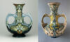
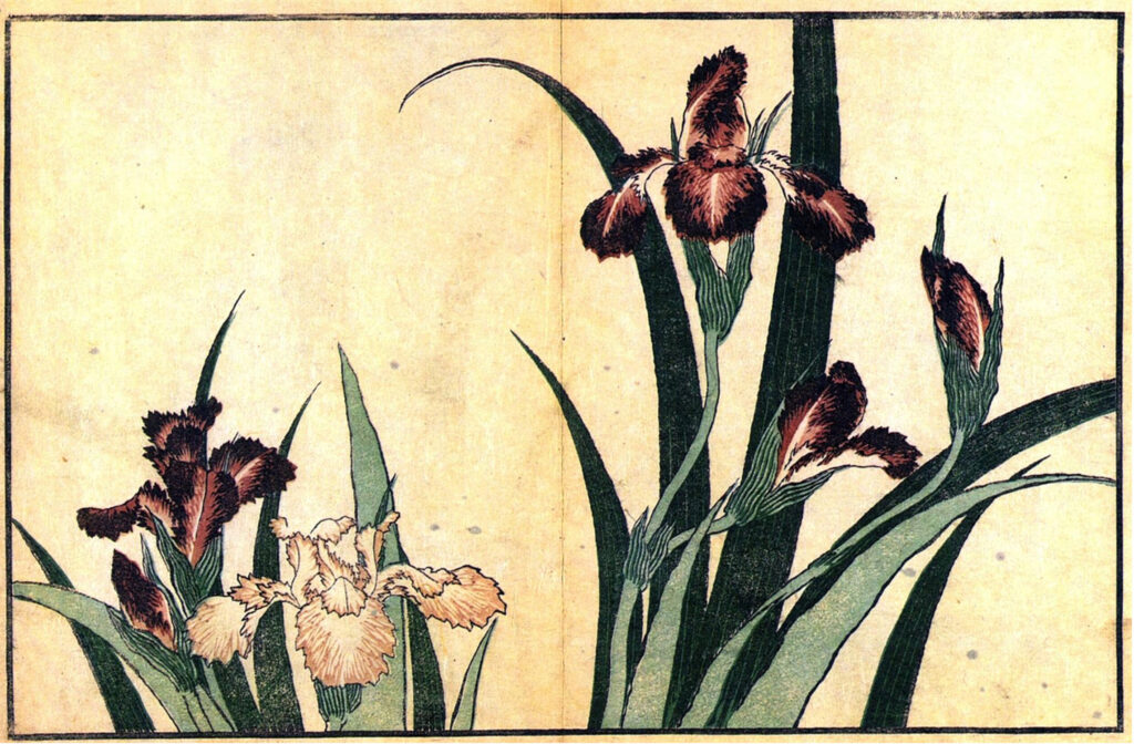
Between 1808 and 1819, Hokusai published a book of ‘Realistic prints by Hokusai’ (Hokusai shashin gafu), which also included a print of Irises. If you mirror this print, a portion of the drawing (the second and third flowers from the right) corresponds exactly with the irises on this pair of Rozenburg vases from 1892 or 1893, painted by Willem Hartgring. The vase’s shape is also influenced by Japonism. These vases are listed in the Rozenburg catalogue as ‘Japanese vases.’

Woodblock print by Katsushika Hokusai depicting irises from the book Hokusai shashin gafu, published between 1808 and 1819. Source: Wiki MediaCommons.
Woodblock print by Katsushika Hokusai depicting irises from the book ‘Hokusai shashin gafu’, published between 1808 and 1819. Source: Wiki MediaCommons.
This pair of Rozenburg vases features three different floral decorations: white poppies, blue irises, and red flowers and yellow leaves. The vases were painted by W.P. Hartgring between 1890 and 1893. According to the catalog, these are "Japanese vases," model 200, 24.5 cm high and 14 cm wide. Source: Art Nouveau Pottery Collection.
This pair of Rozenburg vases features three different floral decorations: white poppies, blue irises, and red flowers and yellow leaves. The vases were painted by W.P. Hartgring between 1890 and 1893. According to the catalogue, these are ‘Japanese vases’, model 200, 24.5 cm high and 14 cm wide. Source: Art Nouveau Plateel.

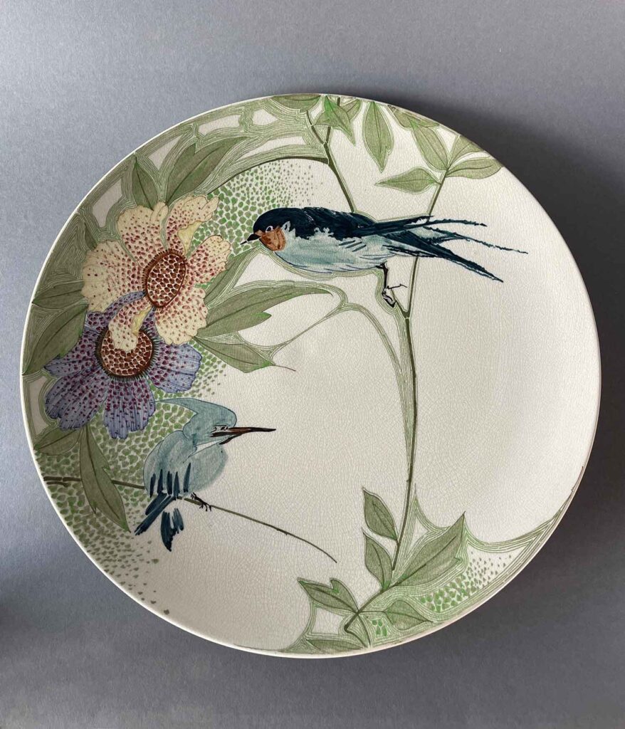
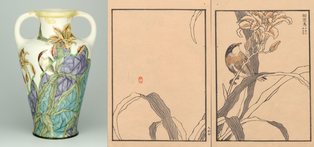
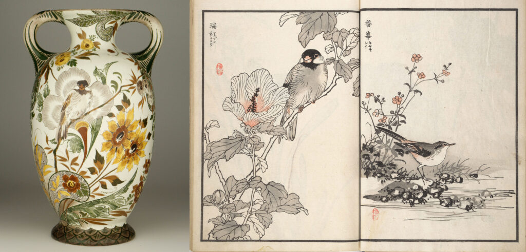
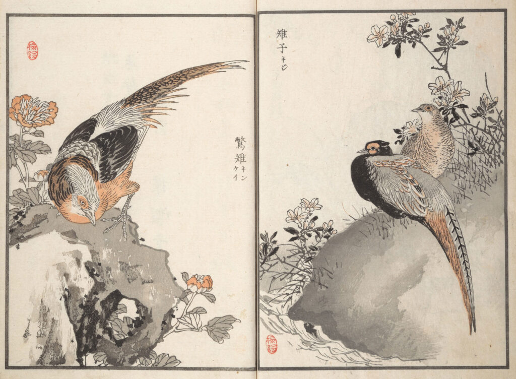
The birds of Kono Bairei

Kono Bairei (1844-1895) was also an important Japanese artist, and his influence extended far beyond Japan after the country entered into international trade relations in the mid-19th century. Bairei was a painter, illustrator, and art teacher. He is best known for his Kacho-ga, his flower and bird prints. His most famous work is the Bairei Hyakucho Gafu (Bairei’s Album of One Hundred Birds), published in three different editions in 1881. These books consisted of one hundred prints depicting birds and plants, drawn with unprecedented dynamic and realism. Bairei’s work had a great influence on artists of the time because of its high quality and the artistic interpretation of the lifelike scenes. The designs are also often asymmetrical, and prints deliberately contain empty spaces (also called ‘Ma’ 間) to create a sense of calm in the composition. This is in contrast to Western art of the late nineteenth century, where the main subject of artists was always prominently displayed on the canvas, canvases were completely filled and artists worked with a number of fixed compositions.

A large Gouda vase with a porcelain decoration featuring birds. The bird and lilies are particularly evident at the top of the vase, inspired by a print by Kono Bairei. The base of the vase, with its shaded areas of color, is typical of Gouda pottery from the 1901-1908 period and is also known as "Kantjes" (Sides). This vase, model 102, is 32 cm tall and painted by Dirk Bordewijk. Source: Ridgetop Collection.
A large Gouda pottery vase with a porcelain decor featuring birds. The bird and lillies are particularly evident at the top of the vase, inspired by a print by Kono Bairei. The base of the vase, with its shaded areas of colour, is typical of Gouda pottery from the 1901-1908 period and is also known as ‘Kantjes’. This vase, model 102, is 32 cm tall and painted by Dirk Bordewijk. Source: Ridgetop Collection.

Sample books for the pottery painters

The books of Kono Bairei became a sought-after collector’s item in Europe towards the end of the 19th century. Their flowing, organic lines were a direct source of inspiration for artists at the dawn of the Art Nouveau, or Jugendstil period. Unlike large paintings, Bairei’s books and the magazines on Japanese woodblock prints were relatively inexpensive and easy to sell. They served as ‘sample books’ that also found their way into the studios of Dutch art academies, artists, and Dutch pottery factories.

A wall plate from the Amsterdam pottery factory De Distel, with a circumference of 44 cm, made around 1900. The compositional similarities between the rooster and hen in Kono Bairei's woodblock print and the wall plate are clearly visible. However, the pottery painters at De Distel took the liberty of filling the background with a decoration of nasturtiums. Source: Proportio Divina.
A wall charger from the Amsterdam pottery factory De Distel, with a circumference of 44 cm, made around 1900. The compositional similarities between the rooster and hen in Kono Bairei’s woodblock print and the wall charger are clearly visible. However, the pottery painters at De Distel took the liberty of filling the background with a decoration of nasturtiums. Source: Proportio Divina.
Tall vase, made by the Dutch pottery factory Zuid-Holland from Gouda between 1901 and 1903. It is model 187, 48 cm tall, painted by Franciscus Fonville. You see two sides of the same vase, each depicting two different birds. A striking detail is that the birds are not from the same print. Fonville's design combines two different birds from different prints by Kono Bairei. Source: Dennis Laseur Collection,
Tall vase, made by the Dutch pottery factory Zuid-Holland from Gouda between 1901 and 1903. It is model 187, 48 cm tall, painted by Franciscus Fonville. You see two sides of the same vase, each depicting two different birds. A striking detail is that the birds are not from the same print. Fonville’s design combines two different birds from different prints by Kono Bairei. Source: Dennis Laseur Collection.
Two prints from the book series ‘Bairei’s Album of One Hundred Birds’. You can see two of the four birds on the vase above.

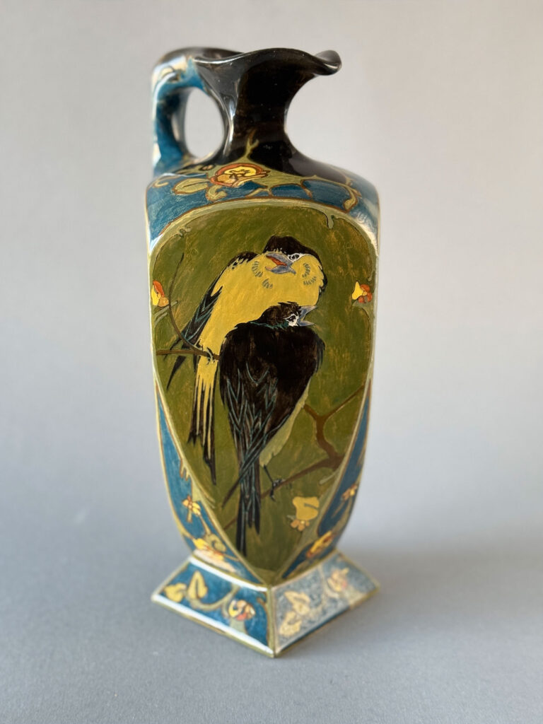
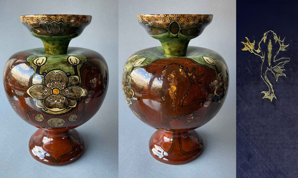
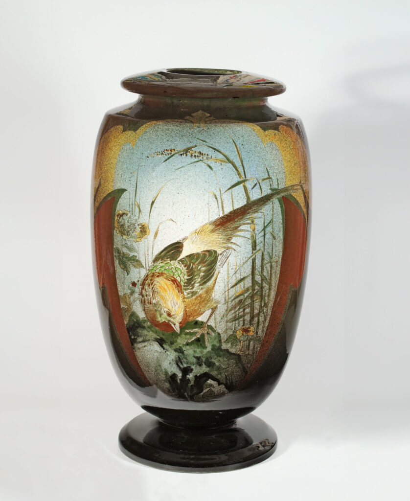
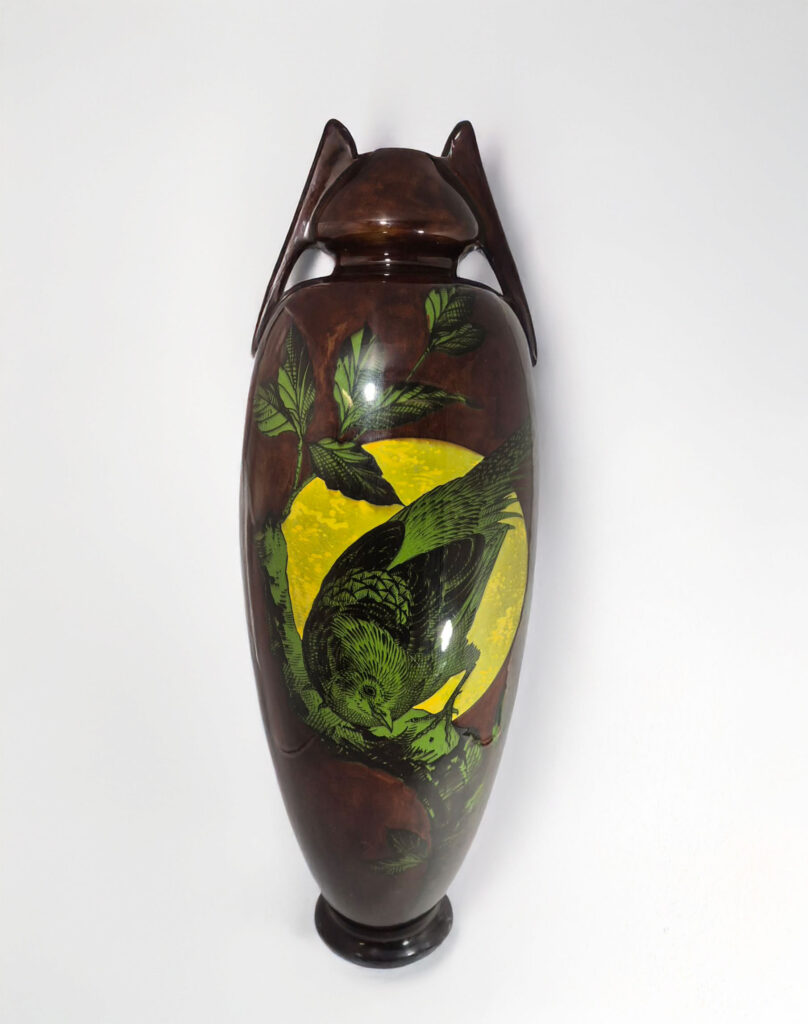
The influence of Japan on the work of Dutch ceramic artist Henri Breetvelt

Dutch artist Henri Breetvelt worked as a ceramist between 1900 and 1923 at various pottery factories, including Plateelbakkerij Zuid-Holland in Gouda (1900-1902), Société Céramique in Maastricht (1902-1906), and Porceleinfabriek De Kroon in Noordwijk (1906-1909). The Kono Bairei birds can be found on many of his painted objects. At all three pottery factories where he worked, he painted vases clearly inspired by the same prints.

The vase above was designed by Henri Breetvelt during his time in Gouda (1900-1902) and painted by Willem Muller. The vase features the 'Delftsch' design and is clearly inspired by the work of De Porseleyne Fles from Delft, where Breetvelt learned his craft as an apprentice. Among the flowers and branches, you can see a bird, which exactly matches a print by Kono Bairei from his book series '100 Birds and Plants' (1895). This is model 131 from Plateelbakkerij Zuid-Holland, 31 cm tall. Source: Ridgetop Collection.
The vase above was designed by Henri Breetvelt during his time in Gouda (1900-1902) and painted by Willem Muller. The vase features the ‘Delftsch’ design and is clearly inspired by the work of De Porseleyne Fles from Delft, where Breetvelt learned his craft as an apprentice. Among the flowers and branches you can see a bird, which exactly matches a print by Kono Bairei from his book series ‘100 Birds and Plants’ (1895). This is model 131 from Plateelbakkerij Zuid-Holland, 31 cm tall. Source: Ridgetop Collection.
Two prints from the book series "Bairei's Album of a Hundred Birds." On the left you see a golden pheasant and on the right a pair of partridges. These woodblock prints were published in 1881.
Two prints from the book series ‘Bairei’s Album of a Hundred Birds’. On the left you see a golden pheasant and on the right a pair of partridges. These woodblock prints were published in 1881.
What’s striking about the vase above, made by Henri Breetvelt at Société Céramique in Maastricht, is that Breetvelt places the Golden Pheasant in a different landscape and also uses a different colour scheme than the original print by Kono Bairei. Only the composition of the bird is entirely similar. The vase was made between 1902 and 1905 and is 60 cm tall. Thanks to Museum Gouda for the photo (vase from a private collection).
Henri Breetvelt also painted the same pheasant during his working period at the De Kroon porcelain factory in Noordwijk (1906-1909). He adopted Kono Bairei’s composition but painted the pheasant in a monochromatic palette of green and black. The bird is placed against a full moon, and the colours give the impression of being seen at night. This is model 17-1, a tall vase measuring 53 cm. Source: Modderkolk Collection.

270
Kono Bairei's print depicting a hawfinch on a blossoming branch. This finch can be seen on the tile on the right, painted by Henri Breetvelt for Porceleinfabriek De Kroon, circa 1906. The tile measures 31 x 41 cm. Photo and collection: Bart van Lienden.
Kono Bairei’s print depicting a finch on a blossoming branch. This finch can be seen on the tile on the right, painted by Henri Breetvelt for Porceleinfabriek De Kroon, circa 1906. The tile measures 31 x 41 cm. Photo and collection: Bart van Lienden.

Japanese and Dutch pottery

The heyday of the Dutch ceramics industry, between 1890 and 1910, coincided with the rise of Art Nouveau, or Jugendstil. Art Nouveau was a very impressive, intense, but very short-lived ‘fashion craze’ that emerged around 1890 as the artists reaction to the overloaded, historical styles of decades before, which were constantly rehashed in various neo-styles. Perhaps that is why the dynamic yet serene Japanese bird prints made such an impression on European artists of that time in their quest for a new, modern artistic language (Art Nouveau means new art) that could bridge the gap between art and craft.

A woodblock print by Yashima Gakutei depicting crabs, made around 1830 and accompanied by two poems. Source: Metropolitan Museum of Art, New York.
Rozenburg vase, model 328B, with a wide belly and two handles, decorated with crabs and sea anemones. Made in July 1900 and painted by D. van Batturn. The vase is 27 cm tall and bears a clear resemblance to the crabs in the print by Yashima Gakutei. Source: Art Nouveau Plateel.

A drive for innovation towards ‘new art’

Japonism certainly played a role in this. Japanese prints, with their innovative compositions and perspectives, were eagerly embraced by the artists of this period. They perfectly matched their drive for innovation. The asymmetry, whiplash motifs, and clear silhouettes, devoid of depth and shadow, of Japanese woodblock prints are recurring themes in the formal language of Art Nouveau.
The influence of Siegfried Bing’s gallery played a key role in bringing together art from the West and the East. A striking detail: the name of his gallery was l’Art Nouveau.

Besides the examples above, where the birds on pottery seem literally copied, you can also see that Dutch pottery painters were strongly influenced by Japonism in creating their own designs. Take this Rozenburg vase, model 393, of 29 cm high, made by the Dutch pottery factory Rozenburg from The Hague in 1901 and painted by Willem Hartgring. Source: Art Nouveau Plateel.
Three objects from the Faience and Tile Factory ‘Holland’ from Utrecht, decorated with cranes or storks. This is a familiar theme in Japanese woodblock prints. Left: Pierre van Achter Collection, centre: Art Nouveau Pottery Collection, right: Jareth Hollub Collection.
This wall charger, made by the Dutch pottery company Zuid-Holland from Gouda, is 37 cm in diameter. It was painted by Frederika Delchambre between 1902 and 1905. The bird motif is clearly influenced by Japanese art. Source: Art Nouveau Plateel.

Zeen is a next generation WordPress theme. It’s powerful, beautifully designed and comes with everything you need to engage your visitors and increase conversions.